Rainbow Charts
This lesson will cover the following
- Explanation and calculation
- How to interpret this indicator
- Trading signals generated by the indicator
Developed by Mel Widner and first described in the July 1997 issue of Technical Analysis of Stocks and Commodities magazine, the Rainbow Charts indicator is a trend-following tool. The core of the Rainbow Charts is a 2-period Simple Moving Average to which recursive smoothing is applied. In this way, nine other moving averages are created, each new one based on the previous average. Recursive smoothing generates a full spectrum of trends and, when visualised on a price chart with each average displayed in a different colour, the pattern resembles a rainbow.
Interpreting this indicator is straightforward. When the market is in a bull trend, the moving average with the least smoothing (the red line) stays at the top of the Rainbow, while the most smoothed moving average (the purple line) remains at the bottom.
When the market is in a bear trend, the most smoothed moving average moves to the top of the Rainbow and the average with the least smoothing drops to the bottom.
As the market moves up or down, the moving averages track the price and cross in sequence as the move develops. If the price moves away from the Rainbow, this indicates a potential continuation of the underlying trend; the Rainbow’s width will usually increase.
If the price approaches or enters the Rainbow, this suggests a potential trend reversal, and the Rainbow’s width will usually decrease. The manner in which the price penetrates the Rainbow signals the strength of the move.
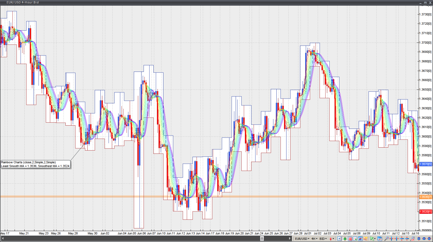
Chart Source: VT Trader