Awesome Oscillator
This lesson will cover the following
- Explanation and calculation
- How to interpret this indicator
- Trading signals generated by the indicator
Designed by Bill Williams, the Awesome Oscillator reflects market momentum. It measures the difference between the 34-period and the 5-period simple moving averages (SMAs), which are calculated not from closing prices but from the midpoint of each bar. The indicator is calculated as follows:
Awesome Oscillator = 5-period SMA ((High+Low)/2) – 34-period SMA ((High+Low)/2)
It is used to confirm market trends or to anticipate trend reversals. As an oscillator, it fluctuates above and below its centreline, with values displayed in a histogram of green and red bars. A green bar indicates that its value is higher than that of the previous bar, while a red bar indicates that its value is lower. Values above the centreline suggest that the short-term period is trending higher than the long-term period, whereas values below the centreline suggest the opposite.
- Trade Forex
- Trade Crypto
- Trade Stocks
- Regulation: NFA
- Leverage: Day Margin
- Min Deposit: $100
Several types of signals can be generated by the Awesome Oscillator:
First, crossings of the centreline. When the Awesome Oscillator crosses above the centreline, it indicates that short-term momentum is increasing faster than long-term momentum. This is a signal to go long.
When the Awesome Oscillator crosses below the centreline, it indicates that short-term momentum is decreasing faster than long-term momentum. This is a signal to go short.
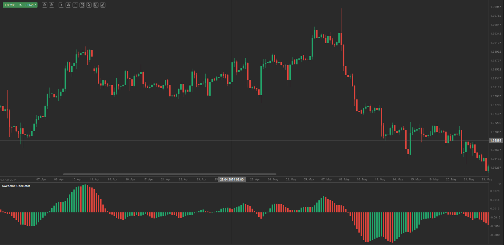
Second, the so-called ‘twin peaks’ formation. This occurs when the Awesome Oscillator forms two peaks on the same side of the centreline. When the two peaks form below the centreline, it offers the trader an opportunity to go long. The second peak is usually higher than the first and is followed by a green bar. The trough between the peaks must remain below the centreline for as long as the setup is valid. The 4-hour AUD/USD chart below shows what a ‘bullish twin peaks’ setup looks like.
When the two peaks form above the centreline, they provide an opportunity to go short. The second peak is usually lower than the first and is followed by a red bar. The trough between the peaks must remain above the centreline while the setup holds.
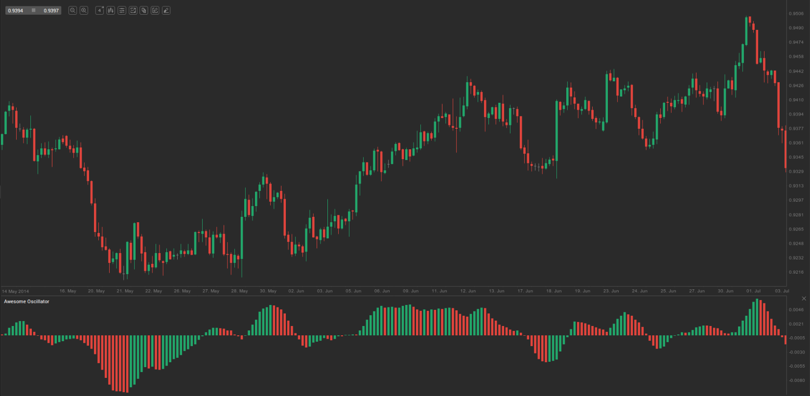
Third, the so-called ‘saucer’ formation. This method seeks to identify quicker changes in momentum. It looks for patterns in three successive bars that are all on the same side of the centreline. A bullish setup occurs when the Awesome Oscillator is above the centreline and two successive red bars are followed by a green bar; the second red bar must be lower than the first. The 4-hour EUR/USD chart below illustrates a ‘bullish saucer’ setup.
A bearish setup occurs when the Awesome Oscillator is below the centreline and two successive green bars are followed by a red bar. The second green bar must be higher than the first.