What is a chart? Types of charts
This lesson will cover the following
- How price movement is visualised through charts
- The time frame of a chart
- Basic methods of visualising price movement
In this topic you will learn what defines a chart, how it’s built and what the specific features of the different chart types are. You can see one visualised in the screenshot below.
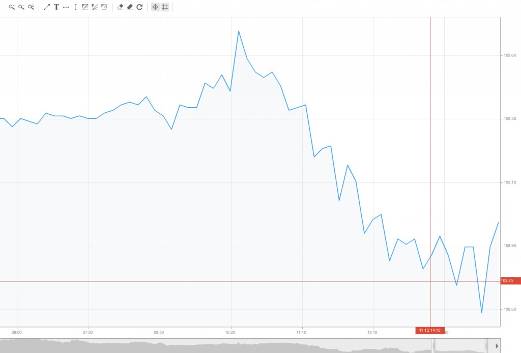
A trading chart is a sequence of prices drawn over a certain time frame. On the chart, the vertical axis (the y-axis) signifies the price scale and the horizontal axis (the x-axis) represents the time scale. Prices are illustrated from left to right across the horizontal axis, with the most recent price movement being the furthest right.
Technical analysts (who trade exclusively on charts) use charts to analyse various types of securities and forecast future price movements.
Although technicians use graphs almost exclusively, the use of charts is not limited to just technical analysis. They can also be of great use to fundamental analysts (who trade using fundamental data) due to their easy-to-read graphical representation of a security’s price movement over a specific period. A graphical historical record helps you to spot the effect of key economic and non-economic events on a security’s price, allows you to assess its performance over a certain period, and shows whether it is trading near extremes (highs and lows) or somewhere in between.
- Trade Forex
- Trade Crypto
- Trade Stocks
- Regulation: NFA
- Leverage: Day Margin
- Min Deposit: $100
Time frame of a chart
 The time frame used for plotting a chart depends on how much we want the visualised data to be compressed. You can have intraday (ticks, 1-minute, 5-minute, 10-minute, 1-hour, 4-hour time frames etc.), daily, weekly, monthly or annual time frames. If you want more detail to be displayed, you will need less-compressed data. However, the greater the compression, the more data can be displayed on the chart (you can’t see two-year-old data on a five-minute time frame).
Daily data comprise intraday data that have been aggregated so that each day is shown as a single period.
Weekly data consist of daily data that have been compressed to show each five-day period as a single data point.
The more the data are compressed, the longer the time frame that can be displayed. Traders focus on charts made up of daily and intraday data (such as 10-minute graphs) to predict short-term price fluctuations because, as we’ve already mentioned, the less the data are compressed, the more detail will be plotted. However, while rich in detail, short-term charts also contain a lot of random noise and can be volatile. Large price spikes, price gaps and wide high-low ranges can distort the overall picture much more easily.
Investors concentrate on weekly and monthly charts to see long-term trends and predict long-term price movements. Most experienced market players, however, use a combination of both short-term and long-term charts. Bigger time frames are used for analysing the general picture and for gaining a broad perspective of the price action. Once the large picture is analysed, a daily or even smaller time frame can be used to zoom in on the last few months, days and hours.
There are four of the most commonly used methods for visualising price movement – Line, Bar, Candlestick and Heikin-Ashi. Each of them has its own advantages and blind spots.
Line chart
Line charts convey a single piece of trading information, which is usually the close (the last price traded during the time frame). Some market participants who trade on a daily rather than an intraday basis consider the closing price to outweigh the open, high or low because intraday swings can be ignored if only the close is taken into account. Moreover, for some indices and thinly traded stocks only closing data are available, making line charts the only viable option.
Bar chart
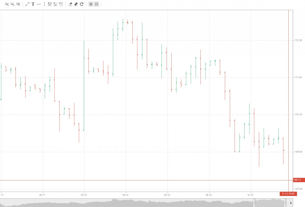
One of the most popular charting methods is the bar chart. In order for each period of the bar chart to be plotted, you will need the high, the low and the close; the open price is not mandatory but is used when available. The high and low are visualised by the top and bottom of the bar. The open price is displayed as a short horizontal line extending to the left of the bar, while the close is the short horizontal line extending to the right. On a daily chart, each bar represents the high, low, open and close for the particular day. Weekly charts have a bar for each week based on Monday’s open, Friday’s close and the high and low for that week.
Some bar charts, however, do not include the open price, which means that the bar is crossed only by the close price. This variation depends on the data available.
Bar charts are more suitable for displaying a large amount of data than candlesticks. The bar chart’s individual bars are relatively thin, enabling users to fit more bars before the chart gets cluttered. Line charts show less clutter as well but also offer less detail (no high-low range). Bar charts that lack an open price are an ideal method for analysing the close relative to the high and low.
Candlestick Chart
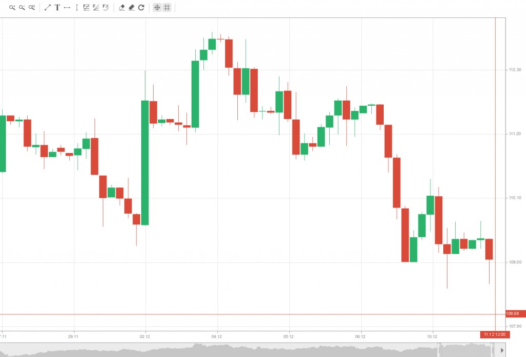
Originating in Japan, candlestick charts have recently become very popular. For a candlestick chart to be plotted, you will need the open, close, high and low of the price together, whereas for a bar chart the open can be omitted. A weekly candlestick is based on Monday’s open, the intra-week high-low range and Friday’s close, while a daily candlestick uses the same price levels but on a daily basis.
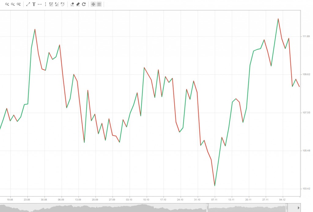
Many investors use candlestick charts because they make the relationship between the open and the close very easy to read. Green candlesticks indicate upward price movement (when the close is higher than the open), while red candlesticks are plotted when the close is below the open. The distance between the open and the close, illustrated as a vertical red or green rectangle, is called the body of the candle. The lines reaching above and below the body are known as shadows and represent the high and low for the respective period.
Heikin-Ashi
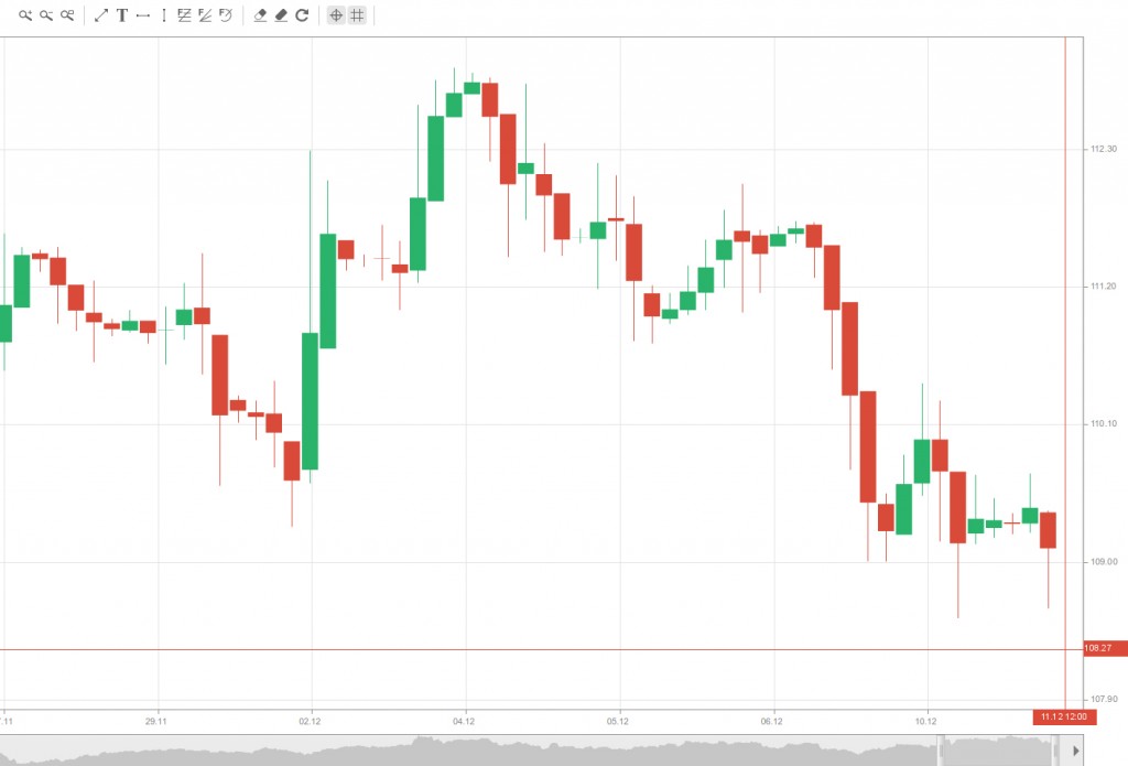
Those familiar with the candlestick chart know that it is one of the best and fastest ways to understand the condition of the market.
Japanese traders sought to make price prediction easier and faster. The Heikin-Ashi chart, which came after the candlestick chart, is one of their achievements. Heikin-Ashi charts allow you to predict more quickly. Furthermore, they are easier than candlestick charts to understand and trade.
A Heikin-Ashi chart looks like a candlestick chart, but the method of calculating and plotting the candles is different.
In candlestick charts, each candlestick shows four different prices: open, close, high and low. Every single candlestick is independent of the others and has no relation to the previous or next candlestick.
How is Heikin-Ashi formed?

In contrast, Heikin-Ashi candles are calculated and plotted using information from the previous candle:
 Open price: the open price in a Heikin-Ashi candle is the average of the open and close of the previous candle.
 Close price: the close price in a Heikin-Ashi candle is the average of the open, close, high and low prices.
 High price: the high price in a Heikin-Ashi candle is the highest value of the high, open and close prices.
 Low price: the low price in a Heikin-Ashi candle is the lowest value of the high, open and close prices.
A Heikin-Ashi chart reacts more slowly than a candlestick chart, and its signals are delayed because of the relationship between the candles. This delay makes the Heikin-Ashi chart a good indicator for volatile currency pairs, as it prevents us from rushing, making mistakes and trading against the market.
Because of this delay, the Heikin-Ashi chart generates fewer false signals and helps us to avoid poor decisions. On the other hand, Heikin-Ashi candles are easier to read because, unlike candlesticks, they don’t have too many different patterns.
Some traders rely solely on Heikin-Ashi. This approach is especially suitable for those who are not patient and disciplined enough, or for those who lose because they enter too early and exit too late. It helps you follow trending markets because it encourages you to wait longer and then lets you in at the beginning of a strong trend.