
Hello there this is tradingpedia.com and this video deals with a concept that is very old in technical analysis. This is called market geometry and it mainly deals with previous support and resistance areas that trader use on the right side of the chart, so basically they interpret what is on the left side of the chart and interpret what is on the right side of the chart to find out where and if the market will hesitate.
In other words, the bigger the timeframe, the bigger the support and resistance and the bigger the likelihood that the market will react on such levels. Support and resistance are of two types – one is horizontal, an area where the price failed in the past and you expect for the market to fail in the future as well. Another one is a dynamic level, one that follows the price action.
Market Geometry – Example
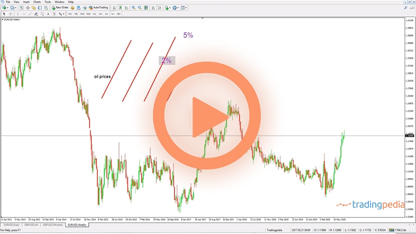
 For example, if we draw a trendline like this, we see that the EURGBP fails at this trendline multiple times. This is a dynamic resistance area and support and resistance change in time.
Market geometry principles call for looking on the bigger timeframes, find out support and resistance levels, and then you look on the lower timeframes for quick reversal patterns, like classic reversal patterns (wedges, head and shoulders, double and triple tops and bottoms, etc.) or Japanese reversal patterns (engulfings, stars, doji candlesticks, etc.). I would always favor Japanese reversal patterns because they take less time than the classic ones.
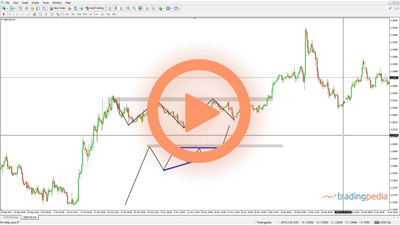
Let’s look a bit on this EURGBP chart and what can we do from a market geometry point of view. It shows the price action from 1996 to 2020, about 25 years of history. We see that the pair fell all the way to here and then bounced and made a new high.
How to Find Out the Fibonacci Ratios
 The first thing to do is to mark the top and the bottom on the monthly chart with two horizontal lines. And then to use a Fibonacci Retracement tool to find out the important Fibonacci ratios (23.6%, 38.2%, 50%, 61.8%) with the 61.8% being the most important level. So we draw a trendline and the market reaches 61.8%.
Coincidence or not, after making a new high in 2008, right during the financial crisis, the EURGBP fell, the sovereign crisis in Europe started and the market retraces to a support level, which is 61.8% of the entire move. This is one thing that traders knew in advance because we can mark the top and the bottom many months earlier before the market actually reaching the level.
Then the key is to go on the lower timeframes and to find out if there is a possible reversal pattern. We see that the market actually formed here a triple bottom – a reversal pattern on a market geometry support level, and when the market broke higher we could go for the measured move. And this is how you use one level.
This is the 61.8% level and it makes sense to mark all the levels. If the market bounced here from the 61.8% it did not do this by chance. Even back in time it hesitated more or less around the same area.
The price had a hard time breaking the area, made a new low, tried again, consolidated in a pennant formation and then popped higher. So this is a previous resistance area that turned into support.
Related Videos
Confluence Area
 At this point in time there are two factors that reinforce the possible bounce on the EURGBP market. On the one hand we have the 61.8% retracement, on the other hand the triple bottom on the lower timeframe, and the third factor is that the previous resistance that acted from 1998 to 2007 for almost ten years, turned into support. This is called a confluence area, where more than one factor comes and support an investment thesis.
Sometimes one can add a dynamic support or a trendline that comes at the same level, and this comes to further support the idea. This is how you use market geometry, a basic example, but consider marking the top and the bottom on the bigger timeframes, find out confluence areas, at least two factors that support your theory, and then go on the lower timeframes and look for reversal patterns and trade them accordingly.
Imagine how many markets are, how many currency pairs exist, indices, commodities, and so on – market geometry works on each and every one of them and with money management and perseverance, anything is possible.
Understanding Market Geometry
 The closest thing to price action trading is market geometry. You may be familiar with price action concepts, meaning that traders buy and sell without using any technical indicator or fundamental concept.
Price action, therefore, means trading with a naked chart. When doing so, the trader is said to respect market geometry principles.
The concept of market geometry goes to the start of technical analysis. Market geometry belongs to the classic technical analysis concepts, but it does not involve patterns used in classic technical analysis, such as the head and shoulders, pennants, or flags.
Instead, market geometry deals with the pure interpretation of price action, starting from scratch and forecasting levels on the left side of the chart based on the historical price data. The only tools used in market geometry are trends and trendlines, Fibonacci ratios, and deviations from the two.
Armed with the info provided by trends, trendlines, channels, and Fibonacci ratios, traders aim at finding support and resistance levels. That is, future support and resistance levels, based on past price action.
Support and resistance may be either horizontal or dynamic. As the name suggests, horizontal support or resistance refers to a horizontal area (not level) where the market might react.
Dynamic support, on the other hand, refers to support or resistance that follows the price action. Think of trendlines and channels, falling or rising, that keep providing support or resistance to the price action.
One important principle of market geometry is called the interchangeability principle. Effectively, it means that when the price breaks support, the level turns into resistance. Also, when the price breaks resistance, the level turns into support.
Building Confluence Areas
 The next task is to find out confluence areas – where the price action has a difficult time breaking an area where multiple elements form stiff support or resistance. Here are some possible combinations that result in a confluence area:
- Two or more horizontal support or resistance levels
- A Fibonacci level
- Classic horizontal support or resistance
- One horizontal and one dynamic level
- Two dynamic levels
Combining dynamic and horizontal support with Fibonacci levels is one way to find confluence areas. These areas have significant importance if they form on a large timeframe. Besides confluence areas, the series of higher highs and higher lows, respectively lower lows and lower highs are also part of market geometry.
Lower Lows/Lower Highs, Higher Highs/Higher Lows
 Trending markets are known to respect the series of lower lows/lower highs (bearish trends) and higher highs/higher lows (bullish trends). As long as the series is valid, the market will keep trending.
But traders use these two series also as a confirmation that the previous trend has ended. Therefore, possible reversals are confirmed when the price action breaks the previous trend’s series.
Market Geometry Analysis – EURJPY Daily Chart Example
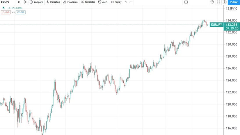
 The daily timeframe below shows the EURJPY’s recent price action. The first thing to note is that the market is in a bullish trend, starting with May 2020. For more than a year, it had formed a series of higher highs and higher lows, typical for rising markets.
The rest of the article will be dedicated to analyzing the EURJPY rise from the lows, using market geometry principles. In hindsight, it is obvious that the market formed a rising trend, but when was the exact time that it became obvious for the trader that a new trend started?
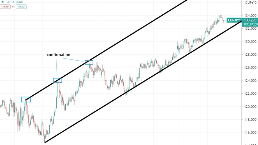
The answer to the earlier question comes from the series of lower/lows and lower highs that belonged to the previously bearish trends. Before building the bullish channel seen above, here are the confirmation steps provided by market geometry (price action).
First, the market bounced from the lows and broke the previous lower high. That is a sign of strength, one that should not be ignored by traders. However, at this point, the trader using market geometry cannot draw the main trendline. For that, the market needs to make a higher low, and then a new high.
A break above the 126-128 area confirms the new bullish trend. From that moment, traders may draw the bullish trendline and project it from the previous lower high (i.e., the first blue square on the chart above). The fact that the market reacts twice at the projected dynamic resistance (i.e., the upper edge of the rising channel) is a confirmation of market geometry.
Now that we have established the angle of the main bullish trendline, we can use it to find future dynamic support and resistance levels with market geometry principles.
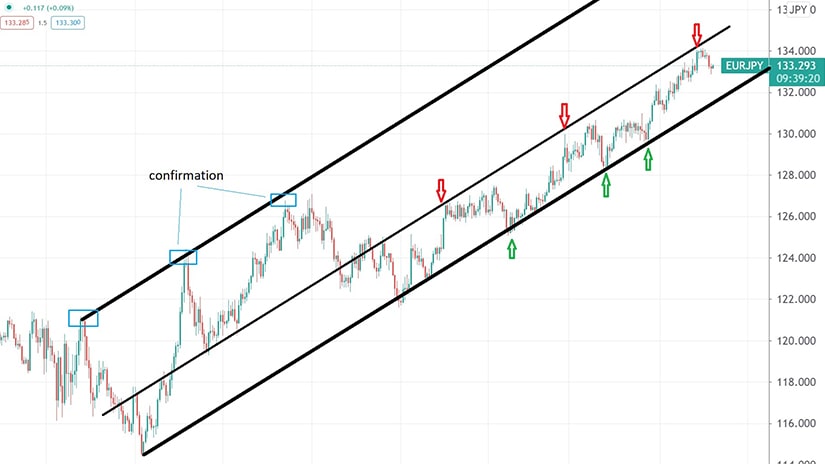
For this, we may project the trendline again, but not from anywhere. We might want to use, you guessed, market geometry principles.
To do so, we project the trendline from previous dynamic support levels inside the rising channel. Following the interchangeability principle of support and resistance, it means that previous support levels turn into dynamic resistance.
From that moment on, we may use the projected trendline to sell the EURJPY at dynamic resistance, and to buy it at dynamic support. As long as the market keeps forming the series of higher highs and higher lows, dynamic support and resistance provide great levels to buy or sell the EURJPY pair.
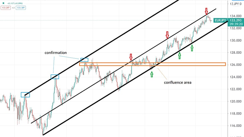
Our last example deals with how to identify a confluence area – an area where the price action finds both dynamic and horizontal support or resistance. We see that the 126 level acted as a confluence area in the sense that the price action met horizontal support given by a previous resistance level, and, at the same time, it met dynamic support given by the rising trendline.
Out of the six trading signals that appear on the chart above, market geometry principles emphasizes the one formed at the confluence area. In other words, the trader should put more weight on a signal forming at a confluence area, as the chances of success increase significantly.