
Hello there, this is tradingpedia.com and in this video we will discuss the different types of trading charts. This is the MetaTrader4 platform, and the types of trading charts we will cover can be found on any trading platform, this being the most popular trading platform for the retail traders.
Roughly, there are three types of candlestick charts to consider – candlesticks charts, line charts and bar charts. From these charts, there are deviations, depending on how complex your analysis is. You can find the three types on the MetaTrader4 right here. If you switch between these buttons, the chart will change its composition – we will do that in a minute.
Candlesticks Chart
 Right now it is important to remember that the candlesticks chart is the most used among retail traders as candlesticks replaced bar charts used at the start of technical analysis. Japanese candlesticks techniques and the concept of a candlestick were introduced in the late 90s when Steve Nison wrote a book about his discoveries related to the Japanese technical analysis.
As it turned out, the Japanese used technical concepts to chart the price of the rice market way back in the 1700s and much earlier than the start of the stock market in the United States. That is considered the beginning of technical analysis.
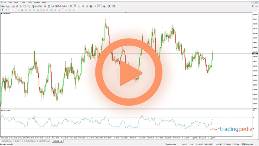
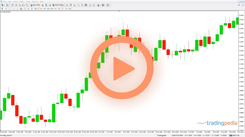
Anyways, coming back to charts, a candlesticks chart shows the opening and closing prices for each period. This is the daily chart on the EURUSD pair, showing the current quotation and the open candlestick. See here this small, red candlestick. Let me zoom in so that you can see it better – this one right here.
Each candlestick shows the opening and closing prices of the previous periods and it has three components. One component is the real body, which represents the difference between the opening and closing prices. This is a bullish real body, because it has a higher closing price than the opening one and this is a bearish candlestick because it has a lower closing price when compared to the opening price and so on.
Each candlestick has an upper shadow, which shows the highest point in the period and a lower shadow that shows the lowest point in the period. Based on the relationship between these three elements, you have various patterns to interpret.
But you can use candlesticks charts without actually using Japanese candlesticks techniques. They come to replace the bar charts by offering a better perspective because on the bar charts you will miss the price action in the real body. Or the real body is not that obvious.
Bar Chart
 A bar chart is similar to a candlesticks chart, in the sense that this will stand for the upper shadow on a candlestick chart or for the lower shadow on a candlesticks chart, and this would be the real body. On the left side of the bar you will have the opening price and on the right side of the bar the closing price. That is the only difference between the two, but if you compare the two, then the candlesticks chart has the advantage of being more visible, more vivid if you want. It allows you to view the real body or the price action within each candlestick better.
Sunday Candlestick
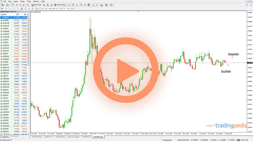
 It is worth mentioning that the timeframe plays a crucial role in the type of chart. For instance, if you look at the daily chart, you should be aware that many brokers decided to exclude the Sunday candlestick. Why? The FX market goes around the clock, 24/5, but it does have a couple of hours, or a few hours of trading in New Zealand. When it is early morning in New Zealand, Monday morning, in the United States is still Sunday. And therefore, that price action viewed on the daily chart is called the Sunday candlestick.
This broker, for instance, uses the Sunday candlestick. As you can see, every five candlesticks, the market forms a small candlestick that represents the Sunday candlestick. Why it is important? Well, if trading takes place on a Sunday, even for a couple of hours or so, then as a trader you will want to know what are the prices that exchanged hands. So keep that in mind when you apply any time of chart on your screen – if your broker shows the Sunday candlestick or not. Because if it does not show it, also the hourly chart will be affected by the missing price action.
Line Chart
 Another possibility for a chart is the line chart. This is the simplest type of chart that exists and sometimes in trading, but also in life, simple things work best in the sense that you could draw a trendline like this to better view the market perspective with a simple line chart. You may even build a channel like this, and so on.
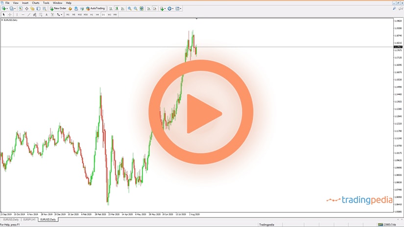
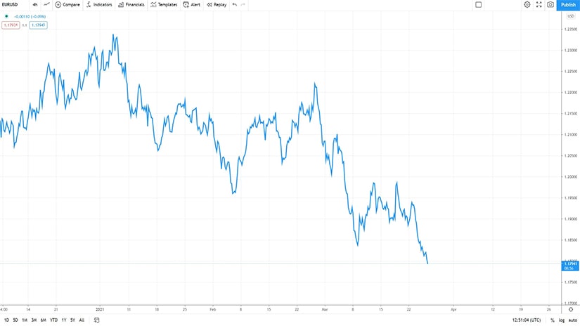
How it is different from a candlesticks chart or a bar chart? If we use the same chart but we switch back to the candlesticks, we see that the upper and lower shadows in the candlesticks chart do not appear in the line chart. In other words, the line chart only connects the closing prices for each period. The line goes from one candlestick to another one, without reflecting the higher or lower points. For instance, on the EURUSD chart, if we go on the candlesticks chart, we see that the EURUSD actually was trading at 1.1905 and then it made a new marginal high at 1.1915. But if we look at a line chart, you will not see that close, that potential double top.
Related Videos
MetaTrader Chart Settings
 These are the main three types of charts, but you can also apply indicators on a chart to alter the way that a chart looks like. You can use point and figure charts, that mostly show vertical columns of Xs and 0s – a beautiful trading theory, one of the oldest that exists.
The MetaTrader also gives you the possibility to introduce the Heiken Ashi indicator on a chart. When applied on a chart, it transforms it and the beauty of it is that it makes it easier to see bullish and bearish trends. All this time the market formed here a bullish trend, this is a correction, this is another bullish trend, and so on and so forth.
The chart changes based on the type of indicators is applied, but keep in mind that the most common type of chart remains the candlesticks chart, as it offers abundant information to traders.
Advantages and Disadvantages of Different Types of Charts
 Technical analysis concepts evolved in time as investors had access to more information and better tools to deal with it. Essentially, technical analysis refers to analyzing historical data to forecast future prices.
It started with the stock market over a century ago and continued with all financial assets where a chart can be plotted. Relatively recent, traders found out that some other types exist in the world than the classic bars chart – e.g., the candlesticks chart.
Also, new charting technologies made it possible to bring back old-school charting techniques, such as point and figure. Nowadays, it is relatively easy to compute the data on a timeframe and to view it from multiple perspectives – candlesticks, lines, bars, Kagi, point and figure, Drummond, etc.
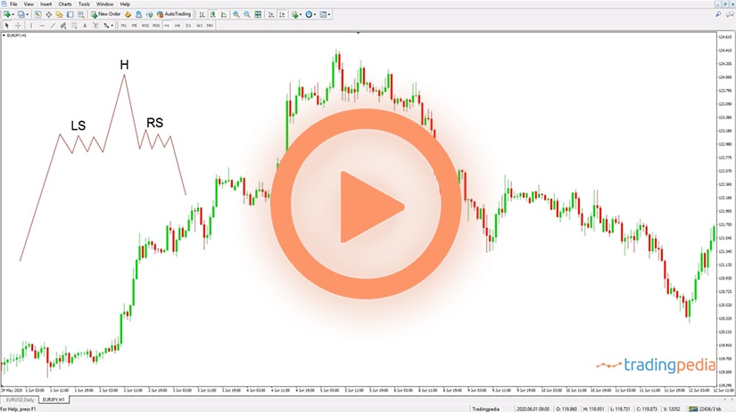
In the end, the type of chart used by traders depends on the trading style and strategy involved. Traders using classic technical analysis patterns, such as head and shoulders or double and triple tops and bottoms, might prefer old-school bar charts.
On the other hand, traders looking for quick reversal patterns might prefer candlesticks charts. Finally, traders looking for a simple interpretation of closing periods’ data might prefer line charts. For this reason, it is important to understand the advantages and disadvantages of each type of technical analysis chart.
Why Is the Candlesticks Chart the Most Popular?
 Nowadays, the candlesticks chart is the most popular among the retail trading community. It has several advantages when compared to other types of charts, the main important one being the way the candlesticks are constructed.
A candlestick has three elements – a real body and two shadows. The length and nature of the real body is given by the opening and closing prices of the period.
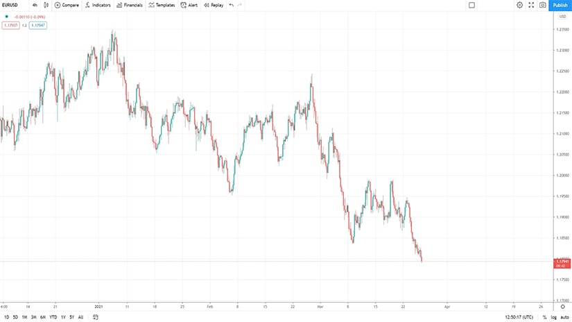
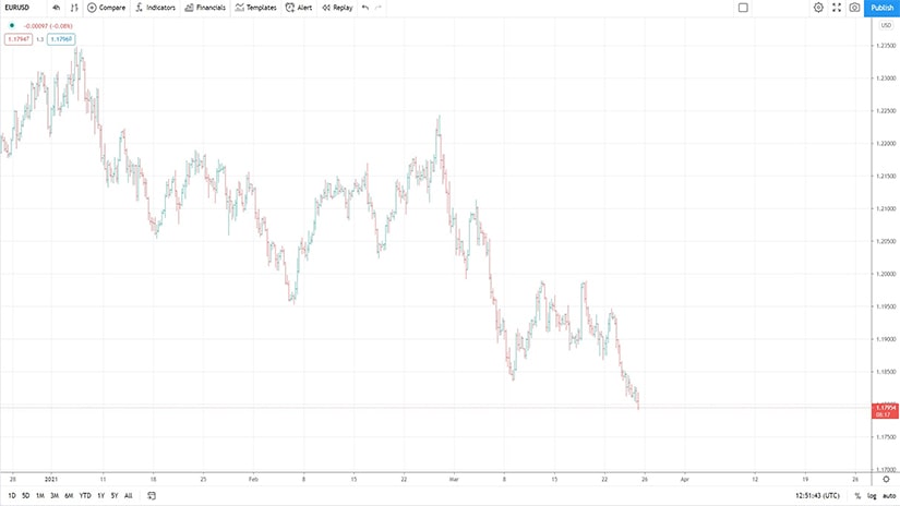
To exemplify, have a look at the chart above. This is the most recent EURUSD 4h chart, and each candlestick starts from where the previous one ended. Red candlesticks reflect bearish price action, and green candlesticks show bullish price action.
If the closing price is above the opening price, the market formed a bullish candlestick. On the other hand, if the closing price is below the opening price, the market formed a bearish candlestick.
The main advantage that candlestick charts have over bar charts is the fact that they are more visible. Also, there is an entire technical analysis approach involving candlesticks patterns, impossible to trade on a bars chart.
Bar Charts and Classic Technical Analysis Patterns
 To this day, veteran technical analysis traders still use bar charts. Such charts are a simple version of a candlesticks chart, the only difference being the real body.
Here, the difference between the opening and closing prices is just a line. Surprisingly or not, this is one of the reasons why some traders prefer bar charts – the charts show more periods on the screen when compared to candlestick charts.
Because of that, it is easier to identify classic technical analysis patterns such as the ones mentioned earlier in this article. Also, some trading strategies are built exclusively on bar charts, which makes it difficult to switch to some other type of chart.
Line Charts – A Simplistic Approach to Technical Analysis
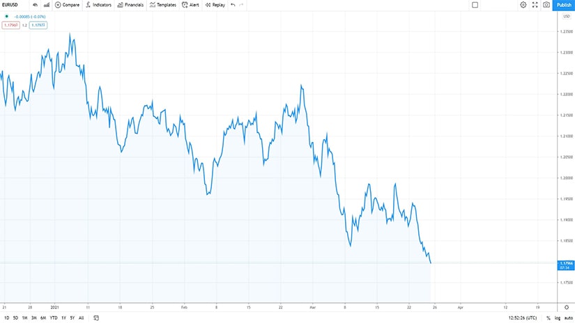
 The simplest way to plot a chart is a line chart. Such a chart uses a line to connect specific points – either opening or closing prices.
However, sometimes a line chart goes beyond just connecting the opening or closing prices in a timeframe. For instance, it may be that the line represents the average of some periods, and thus it is a bit different to interpret.
The main advantage of a line chart is exactly its simplicity – just a line connecting points on a chart, making it easier to interpret bullish or bearish trends and breakouts.
Area Charts – Just Another Type of Line Charts
 An area chart is a line chart that highlights the area below the line. It is a popular way among financial media outlets to point out the decline (or rise) of a financial asset, but other than that, it is no more than a line chart.
If you want, it represents a different visual interpretation of a line chart.
Point and Figure Charts
 Point and figure charting is one of the oldest charting techniques that survived the test of time. Its roots go back to the day when traders wrote down each day the market’s closing prices and then calculated boxes for spotting both reversal and continuation patterns.
The biggest advantage of a point and figure chart is that it compresses time. To better understand the concept, have a look at the chart below – it shows the EURUSD price action in the last decade! How come that one single chart comprises so much info?
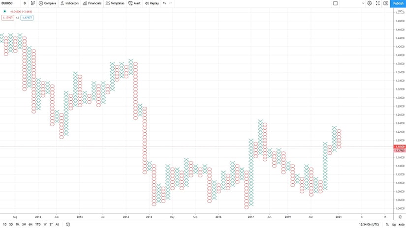
The answer comes from the “boxes” represented on the chart. As you can see, a point and figure chart is nothing but an alignment of columns of Xs and 0s.
As the chart makes it evident, Xs are bullish, and 0s are bearish. Therefore, a vertical column of Xs shows a bullish trend, while a vertical column of 0s shows a bearish trend. The beauty of it is that the chart will plot a new column only if a reversal box appears.
Many types of reversal boxes exist, and these days most trading platforms use the Average True Range (ATR) for the last 14 days as a benchmark. As such, a three-day box reversal means that the chart will plot a new column when the market reverses above the ATR seen three days ago. If not, the trend continues.
Point and figure charting is unique in many ways, and various strategies exist to follow the trend and to spot reversals. It used to be time-consuming to keep track of the boxes, but nowadays, the advances in charting software made it possible to revive these types of charts.