
Hello there, this is tradingpedia.com and this video deals with an important technical analysis concepts – one of the oldest concepts that exist, called point and figure charting. This is only an introduction to how to trade with it. I would like in this video to present the elements of this theory and just to pinpoint the basics of it, but on future videos we will look at more details on how to use it.
Point and Figure Chart
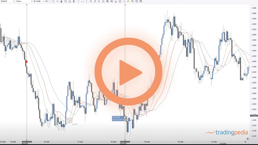
 This is the GBPUSD daily chart, showing normal candlesticks. Before candlestick charts, bar charts existed in the United States and then candlesticks increased in popularity, especially among retail traders. But many other types of charts exist, and one of them is point and figure. Its biggest advantage is that it reduces the market noise.
For instance, on this GBPUSD chart we see mostly bullish and bearish candlesticks, or green and red ones, but most of the time the market just not moves. For instance, this is a range for more than a month, this is another, and so on. Therefore, the main difference between point and figure charting and classic charts is that point and figure comprises the time element.
If we switch to a point and figure chart on the GBPUSD, it looks like this. What is the biggest difference that you can see here on chart? The first thing to note is the time element. For instance, on the classic candlesticks chart, its shows the price action on the previous six months up to November 2020. However, if we switch to a point and figure chart we see the price action all the way back to 2006 and even to 1994. Therefore, the price action for the last two decades appears on this chart.
Chart Elements
 As you can see, a point and figure chart has two elements – Xs and Os. These two form on vertical columns – one that is rising, and one that is falling – bullish or bearish. The chart starts a new column on the right side of the present one only when certain conditions happen. More precisely, only when the market travels certain distances. If the market does not do so, the chart simply remains unchanged. This is the explanation for why point and figure charts cover such long periods of time in one single chart.
What is Box Reversal
 So, what is the catch here? The catch comes from the concept of a so-called box. This is the reversal needed for the market to switch from bullish to bearish or bearish to bullish conditions. In this case, let’s focus on the current price – 1.3032. It has put four different Os to the downside, signaling a bearish trend on the GBPUSD. The market will only start a new column on the chart only when a certain move in the opposite direction happens. That move is related to the box that I mentioned a bit earlier.
There is a fine art in how to establish the size of this box. For some currency pairs, it could be 100 pips. On some other ones, that have smaller ranges, the box size should be smaller than that. Let’s assume that for the GBPUSD the box size is 100 pips. Therefore, in order for the chart to start an Xs column, the market need to travel in the opposite direction more than 100 pips, or more than the distance we established in the box.
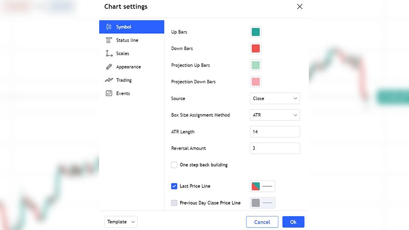
That is called a 1-box reversal, but we can set the reversal condition to 2-box reversal or 3-box reversal. The more reversals considers, the fewer the number of columns will appear on the chart. For example, if we right-click on the chart and go on Settings, for the length of the box size we use the ATR – Average True Range. The ATR is calculated on 14 periods, the default setting.
Look at the reversal box. It means that on a box size of ATR with 14 periods, in order for the GBPUSD to post a new O or X column, the market must travel three-times the ATR for the last 14 periods. Does it make sense? Let’s put it in a simpler form and change the reversal to 1. It means that if the GBPUSD reverses by more than the last ATR in the last 14 periods, the chart will put an X, or if it moves to the downside more than the ATR for the last 14 periods, it will add another O to the chart. However, if the market does not exceed the ATR for the last 14 periods on any given day, the chart will not plot an X nor an O.
The 3-box reversal is the most common one to use and if the 3-box reversal is 300 pips, if the market does not reverses that much, the chart remains unchanged.
Related Videos
Point And Figure Trading
 Point and figure is one of the oldest trading theories in the world. In time, it suffered many changes. At one point, it got abandoned because of the difficulty of updating the charts.
But improved technologies led to the appearance of computers and software that automatically plot the point and figure charts. Yet, not even today, the trading theory is not that popular among retail traders.
One explanation is the fact that reading a point and figure chart is more difficult than reading a classic chart. A bar, candlesticks, or line chart are typically the default types of charts offered by any brokerage firm. Rarely will you see a point and figure chart and traders need to go the extra mile to build one.
However, some trading platforms do offer the possibility to convert a classic chart into point and figure. For example, TradingView does so, and this is what we use to exemplify point and figure trading. Even if it didn’t, point and figure expert advisors exist that can be used to convert a classic chart into point and figure on the MetaTrader platforms.
Compressing Time
 The biggest impact point and figure charting has on a market is time compression. More precisely, the price action or the trending does not form on the horizontal, as it is the case with classic charting. Instead, it forms on the vertical.
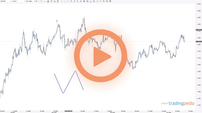
A trend is made of a series of higher highs and higher lows (bullish) and lower lows and lower highs (bearish). As long as the pattern holds, the point and figure chart will simply make changes only on the vertical, despite the fact that time passes.
The result is that the time is compressed, and thus point and figure charts may end up showing the price action in the last two decades, for instance, while a classic chart only provides the last couple of months.
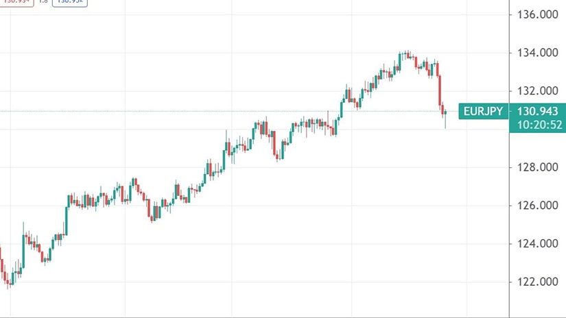
Here is the daily EURJPY chart. It shows the price action on the EURJPY cross in the past eight months using candlesticks. Therefore, the period covered and the one that the trader can analyze is eight months.
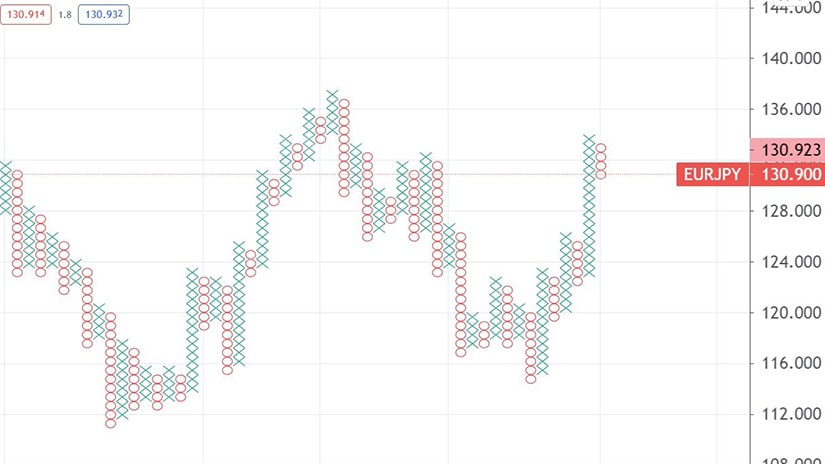
But a point and figure chart covers a much bigger period. Below you can find the same EURJPY pair, the same timeframe, only instead of candlesticks, point and figure appears. The chart covers the price action in the last four years, instead of only eight months.
Moreover, the years are not equal on the chart. Depending on how many columns of Xs and 0s are, the number of years covered differs significantly.
Xs and Os
 As the chart above shows, point and figure trading is nothing but interpreting columns of Xs and 0s. Bullish price action is represented by an X, while bearish price action by a 0.
Therefore, a column of Xs shows a bullish trend is in place, while a column of 0s reflects a bearish trend. The focus for traders is to join these trends, by interpreting either the market reversals or the trending conditions.
The conditions for a reversal differ from strategy to strategy. Depending on the type of the trading strategy, aggressive or conservative, the columns may change drastically.
A reversal refers to the moment when the chart starts plotting an X after a column of 0s. Or, one 0 after a column of Xs.
In point and figure trading, the reversal is given by the box size. The box represents the minimum distance that the market must move in the opposite direction so that a reversal takes place.
It is typically set by the ATR or the Average True Range. A three-box reversal means that the market must travel three times its ATR 14 days range, in order for the chart to start plotting a different column than the current one.
But it could be customized. Some traders use only one-box reversals, some other ones use five-box reversals, and so on. Naturally, the smaller the number of box reversals, the bigger the number of columns on the chart.
Various trading strategies can be built with point and figure charting, and here we will focus only on one. Remember that this is just an introduction to point and figure trading, as there is much more to know about it, such as how to trade with the 45-degree angle trendlines.
Bullish and Bearish Signals with Point and Figure Charting
 So far, it became obvious that trading with point and figure charts means following trends. Trend trading, therefore, is the main trading strategy, and traders focus on finding the right places to go long or short.
Here are a few examples of bullish and bearish signals given by a point and figure chart. Starting from left to right, they point the entry to join an already existing market trend.
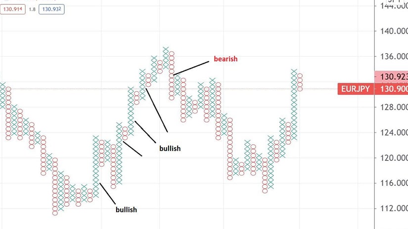
We see that the EURJPY price declined during 2016. At one point, it formed some kind of a triangular pattern, but no column of Xs was strong enough so as to break the highs in the previous column of Xs.
When it happened, it was the first bullish sign, signaling the entry on the long side. At that point, the EURJPY traded close to 116.
The columns of 0s that followed were not enough to break below the previous column of Xs, so that the bullish conditions remained in place. By the time the new column of Xs makes a new high, that is the place to add on the long side, somewhere close to 124.
Following the same principles, the third entry on the long side happens around 130 and all three longs are closed when a bearish signal appears close to 131. By summing up the three long positions, we see that the bullish market was responsible for a hefty profit, and even the bearish signal turned out to be close to the market top.
All in all, point and figure represents just a different way of looking at markets. Because it compresses time, traders have the big advantage of interpreting more historical data than when using classic charts.