 Even though point and figure charts have never been particularly popular, they are among the most interesting charts used for long-term investment goals and predictions.
Their aim is to minimise superfluous data and present a clear view of trends. The main focus is on supply and demand, although emerging trends are also taken into account. Overall, the objective is to determine the optimal points at which to buy and sell on the stock market. Despite having their critics, many still consider them reliable, even though they lack popularity.
Construction of Point and Figure Charts

Much like line charts, traders who use P&F charts aren’t overly concerned with intraday highs and lows; instead, they focus on an asset’s closing prices. They believe the highs and lows provide irrelevant information that can’t (and shouldn’t) be used in the decision-making process of trades or investments. Such traders are interested solely in the bigger picture and regard intraday price fluctuations as nothing more than noise.
Unlike line charts, however, P&F charts do not account for time, which is why they lack a time axis. Here, the main focus is price. The price movements of the asset are symbolically represented not by lines or bars, but by Xs and Os. If the price rises, an X is plotted; if it falls, an O is recorded. There is no point in adding these changes to the chart unless there has been a movement of at least one price unit in either direction; as you can see, even though P&F charts can appear confusing, they follow a minimalist approach.
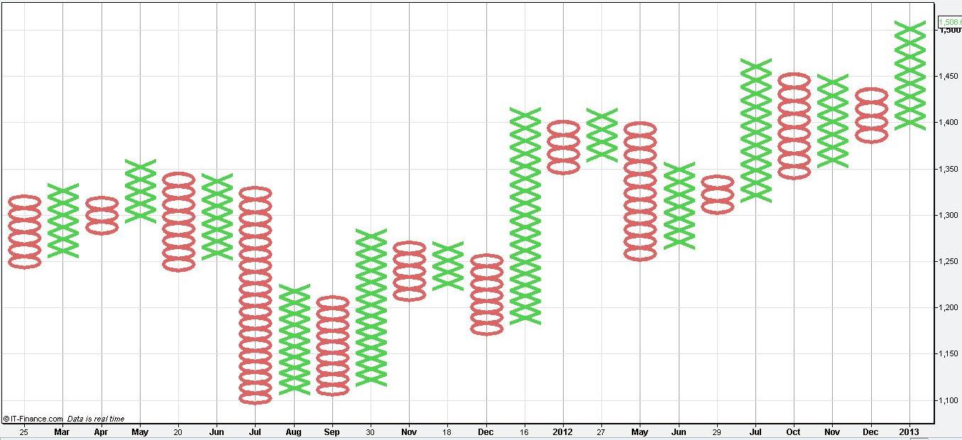
Each movement in price is represented by a symbol. If the price rises by four units, we will see four Xs in the same column. If the direction changes, a new column begins, and the decline is reflected by the appropriate number of Os. Because of this core principle of chart construction, Xs and Os never share a column. There is an important point to be made here. The chartist must decide how many units the price needs to move in the opposite direction before a new column is created. Once this number is set, it is called a box.
This means that if we are following a stock trading at USD 20, using USD 1 as the unit and a box size of 2 units, the price must fall by at least two units before we create a new column. In this example, let’s assume an uptrend in which the asset’s price rises from USD 20 to USD 24. In that case, each unit (every USD 1) is represented by an X. If the price then starts to fall, it must decline by at least 2 units before we reflect the change in a new column. Otherwise, the change is considered irrelevant.
Let’s say the price decreases by USD 3. In this case, we create a new column containing 3 Os, because all significant changes have to be recorded. Remember that chartists determine the box size, so it doesn’t have to be 2 units every time.
- Trade Forex
- Trade Crypto
- Trade Stocks
- Regulation: NFA
- Leverage: Day Margin
- Min Deposit: $100
Importance and Usage

P&F charts have little value in short-term trading. They are used to determine long-term trends and to base investment decisions on that premise. P&F charts are invaluable for identifying overarching trends but shouldn’t be used for short-term decisions or trading. Remember, this is only a basic overview of P&F charts, and you will need to carry out further research and reading to become familiar with more advanced concepts in this field. P&F charts are important in the long run and can be very helpful to a skilled trader. They provide all the basic information you will need without superfluous data. Although they are not particularly popular, they are deeply integrated into the process of technical analysis.