A price chart is a sequence of prices plotted over a certain time frame.
Basic chart of a company
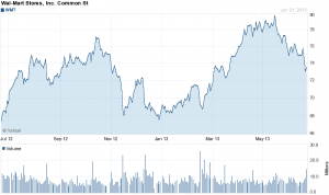
On the chart, the y-axis (vertical axis) represents the price scale and the x-axis (horizontal axis) represents the time scale. Prices are plotted from left to right across the x-axis with the most recent plot being the furthest right.
Technical analysts use charts to analyze various types of securities and forecast future price movements. While technical analysts use charts almost exclusively, the use of charts is not limited to just technical analysis. Because charts provide an easy-to-read graphical representation of a securitys price movement over a specific period of time, they can also be of great benefit to fundamental analysts. A graphical historical record makes it easy to spot the effect of key events on a securitys price, its performance over a period of time and whether its trading near its highs, near its lows.
Time frame of a chart
The time frame used for forming a chart depends on the compression of the data: intraday, daily, weekly, monthly, or annually. The less compressed the data is, the more detail is displayed. Daily data is made up of intraday data that has been compressed to show each day as a single data point, or period. Weekly data is made up of daily data that has been compressed to show each week as a single data point. The more the data is compressed, the longer the time frame possible for displaying the data.
Traders usually concentrate on charts made up of daily and intraday data to forecast short-term price movements. The shorter the time frame and the less compressed the data is, the more detail that is available. While long on detail, short-term charts can be volatile. Large sudden price movements, wide high-low ranges and price gaps can affect volatility, which can distort the overall picture.
Investors usually focus on weekly and monthly charts to spot long-term trends and forecast long-term price movements.
Others might use a combination of long-term and short-term charts. Long-term charts are good for analyzing the large picture to get a broad perspective of the historical price action. Once the general picture is analyzed, a daily chart can be used to zoom in on the last few months.