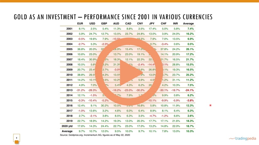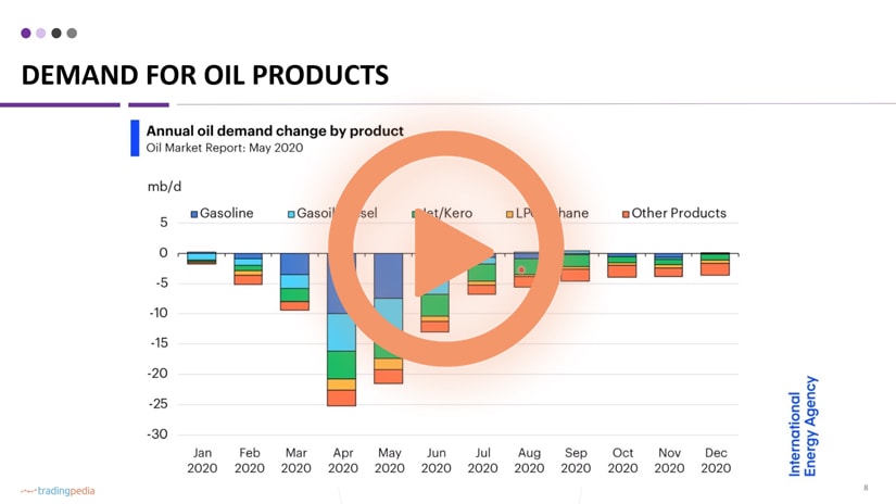
Hello there, this is tradingpedia.com and we continue our series dedicated to trading gold. This time we move to the most interesting part – how to trade gold.
Overview
I initially planned to have this part covered toward the end of this project but this way it will be more interesting. We already mentioned that there are various ways to gain exposure to gold. One way is to own the physical stuff, another way is to trade CFDs, ETFs, or to use it as a safe-haven and hedge against inflation.
Why to Check The Price History of Gold
One of the ways to trade gold is to look at a historical perspective in the sense that one should check the price history. This is something I recommend on all markets to trade. Those familiar with the Elliott Waves Theory can find many videos here that deal with the subject. The theory covers impulsive and corrective waves by counting various cycles using a so-called top/down analysis, a historical perspective.
For instance, if you trade the EURUSD, what you should do is you should go on the trading platform offered by the broker and check the bigger timeframe, the monthly chart. However, it does not mean that you have all the historical data there, so you need to do some research. With that research in hand, you can start counting cycles until you reach the current prices.
Therefore, the historical perspective is helpful in understanding where the price was, where it is now, and what the price did in the meantime. I’m not trying to tell you that the count seen here is a valid Elliott Waves count, because I am not an expert. I just try to show one interpretation of the rise in the price of gold over time.
Related Videos
How the Price of Gold Evolved in Time
The main idea is that gold, at one point in time was close to zero and then advanced in an almost parabolic move. Next, it corrected in a three-wave structure, falling back to $200, losing half of its value. Then, it exploded higher.
The values here are based on closing data on the yearly charts, but corrections did exist. This is an example of the average price of gold, showing how it evolved in time. For example, Isaac Newton was the master of the UK Mint and set the gold price at 3.75 in 1717 and it remained like this for a long time.
In 1914 the price of gold changed and started to rise. Slowly but surely it gained ground, and a two-tier system was created in 1968. The point here is that one can use old data, even yearly data in the form of average prices. With the resulting interpretation, you go on the lower timeframes.
For instance, this is gold from 1791 but the chart is not based on this data on the right. It goes all the way to 2015 and this was the point before the decline. We are in 2020 now, and from that moment, the market consolidated for a while, and in 2020 made a new all-time high. It means that this chart, at that point in time, was true – a double three running ending with a triangle that broke higher in the summer of 2019 before the 2020 pandemic.
With this information on big timeframes, one can go on the lower ones and trade in the direction of the trend. This scenario was looking for a bullish potential and a bullish break came.
Let’s move on with the next video – bye, bye.


