Here you will learn how to use charts for trading binary options. Charts are immensely useful in technical analysis. In fact, they are among the most important tools we can possibly utilize to our advantage. Youve probably seen at least a few charts here and there. They are used in many fields but usually with the same idea – to provide a visual representation of numerical values.
One of the numerical values is usually time and the other one can vary from field to field. In most cases charts are used to help us visualize the changes that have occurred over a set period of time. In the case of technical analysis, charts are used to present the price fluctuations of a certain asset within a given time perimeter. As an example, a chart may present the price alterations of an asset for a period of one year and each of the points in the graph can represent the closing price of the asset for any given day of the year. By seeing the numbers in a graphical manner, we can more easily visualize the changes and spot any trend in the process.
As you can see on the example, the alterations of the price are much easier to visualize and hence the trends easier to spot. The time frame is usually displayed at the bottom, running horizontally (or the x-axis), while the values are presented at the side, running vertically (or the y-axis).
Chart Properties

Even though a chart can significantly simplify the data we have and present it a way thats to follow and comprehend, its still important to know what we are actually looking at when we have a chart in front of us. Its rather easy to decode the data once we know what to look for. There are free main factors that can influence the information provided on the chart. These factors are the time scale, price scale and the price point. Well start with the time scale.
Time Scale

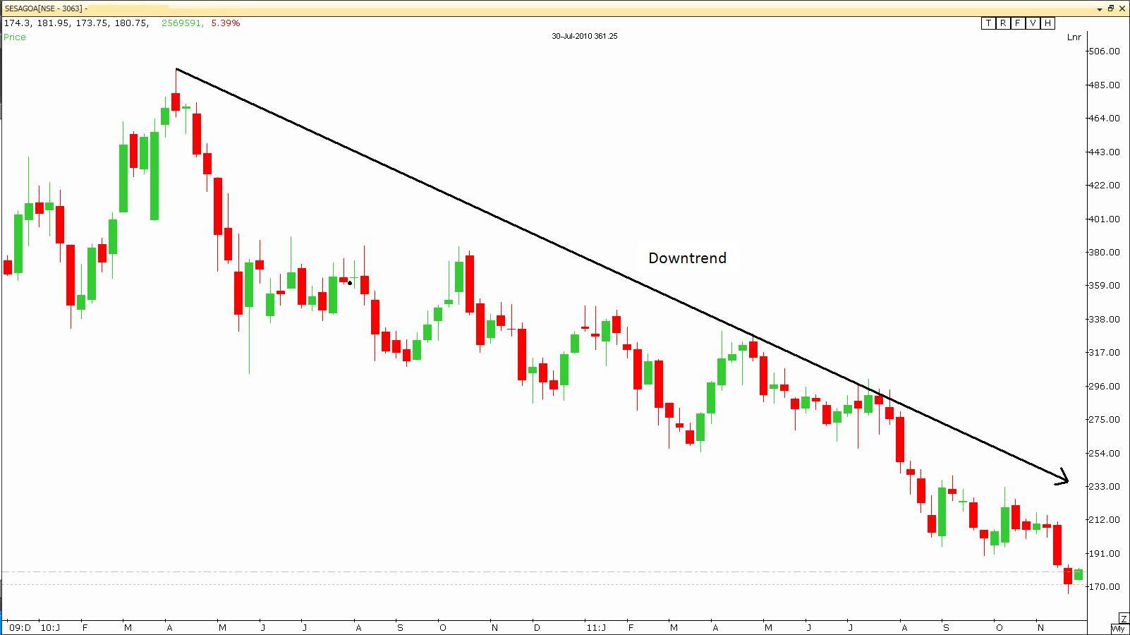
As the name suggests, the time scale us used to define the scale of time we are using in the chart. It can range from mere minutes to entire years, although most commonly you will find that people are using smaller scales like intraday, daily, weekly, monthly or quarterly. The most detailed charts are the ones with the smallest time scale. This means that they reflect smaller changes within the given time frame. The data points can represent different values, like closing price, opening price, the high, the low, etc. What points are used depends on the objectives of the chart.
Intraday charts show us the price alterations within the time frame of a day. This means that they can reflect the price changes with a 5-minute time frame, or the whole day from start to finish.
Daily charts reflect the price movements of a whole day and are all compressed into one data point. They are spread out in longer term charts in order to spot any past and possibly emerging trends.
Weekly, monthly and quarterly charts have the objective of presenting long term trends. The price movements of the whole period will be presented by just one point in the larger scheme of things. To give you an example, if you are looking at a weekly data spread over a 10-year period of time, then every data point will represent the closing price (in most cases and for the sake of this example) of the asset for the given week. This way you will probably be able to spot trends (if there are any) from the past and possibly predict a future one.
Price Scale and Price Point Properties

The price scale is the side of the chart and runs vertically. It serves as a visual representation of a stocks current monetary value as compared to past values. Sounds like a simple enough concept but its made much complicated when we take into consideration the fact that it can be constructed in two ways – arithmetic or logarithmic.
The arithmetic way is much simpler. If the chart has been constructed using this method, then the space between all the values will be the same (meaning that the distances between the values will be same). There will be no change whether youre going from 20 to 30 or from 60 to 70. Simply put, the measurements are put in absolute terms with equal distances.
However, if we are using logarithmic terms, this is where things get a bit more complicated. This is because the increases are made in terms of percentages (instead of absolute terms like in the arithmetic way). This means that there will be differences in the two charts of the same values, but constructed using different methods. For example, the increase from 20 to 30 is 50% whereas from 60 to 70 it is a bit more than 16%, which means that the distance between 20 and 30 will be bigger than the distance between 60 and 70. Take a look at the examples below.