How Are Charts Formed?
Among the most popular methods of using a chart for reading the market or visualizing it are the next 3 types. Each of them has its own advantages and blind spots.
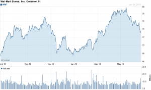
Some investors and traders who trade on a daily but not intradaily basis consider the closing level to be more important than the open, high or low. By paying attention to only the close, intraday swings can be ignored. Line charts are also used when open, high and low data points are not available. Sometimes only closing data are available for certain indices, thinly traded stocks and intraday prices.
Bar Chart

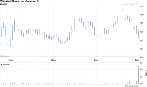
Perhaps the most popular charting method is the bar chart. The high, low and close are required to form the price plot for each period of a bar chart. The high and low are represented by the top and bottom of the vertical bar and the close is the short horizontal line crossing the vertical bar. On a daily chart, each bar represents the high, low and close for a particular day. Weekly charts would have a bar for each week based on Fridays close and the high and low for that week.
Bar charts can also be displayed using the open, high, low and close. The only difference is the addition of the open price, which is displayed as a short horizontal line extending to the left of the bar. Whether or not a bar chart includes the open depends on the data available.
Bar charts can be effective for displaying a large amount of data. Line charts show less clutter, but do not offer as much detail (no high-low range). The individual bars that make up the bar chart are relatively skinny, which allows users the ability to fit more bars before the chart gets cluttered. If you are not interested in the opening price, bar charts are an ideal method for analyzing the close relative to the high and low. If you are interested in the opening price, candlestick charts probably offer a better alternative.
Candlestick Chart
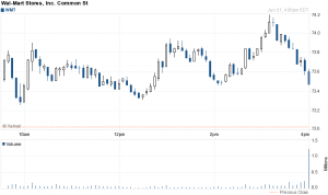
Originating in Japan candlestick charts have become quite popular. For a candlestick chart, the open, high, low and close are all required. A daily candlestick is based on the open price, the intraday high and low, and the close. A weekly candlestick is based on Mondays open, the weekly high-low range and Fridays close.

Many traders and investors believe that candlestick charts are easy to read, especially the relationship between the open and the close. White (clear) candlesticks form when the close is higher than the open and solid candlesticks form when the close is lower than the open. The white and solid portion formed from the open and close is called the body (white body or solid body). The lines above and below are called shadows and represent the high and low.


