Awesome Oscillator
This lesson will cover the following
- Explanation and calculation
- How to interpret this indicator
- Trading signals, generated by the indicator
Designed by Bill Williams, the Awesome Oscillator reflects market momentum. It represents the difference between a 34-period and a 5-period Simple Moving Averages (SMA), which are not calculated on the basis of closing prices, but rather on the basis of the midpoint of each bar. The indicator is calculated as follows:
Awesome Oscillator = 5-period SMA ((High+Low)/2) – 34-period SMA ((High+Low)/2)
It is used in order to confirm market trends or to expect trend reversals. As an oscillator, it fluctuates above and below its centerline, with values presented in the form of a histogram of green and red bars. A green bar indicates that its value is higher than that of the prior bar. A red bar indicates that its value is lower than that of the prior bar. Values above the centerline suggest that short-term period is trending higher compared to the long-term period. Values below the centerline suggest that short-term period is trending lower compared to the long-term period.
Several types of signals can be generated by the Awesome Oscillator:
First, crossings over the centerline. If the Awesome Oscillator crosses above the centerline, this is considered as an indication that short-term momentum is currently increasing at a faster pace than long-term momentum. This is a signal to go long.
If the Awesome Oscillator crosses below the centerline, this is considered as an indication that short-term momentum is currently decreasing at a faster pace than long-term momentum. This is a signal to go short.
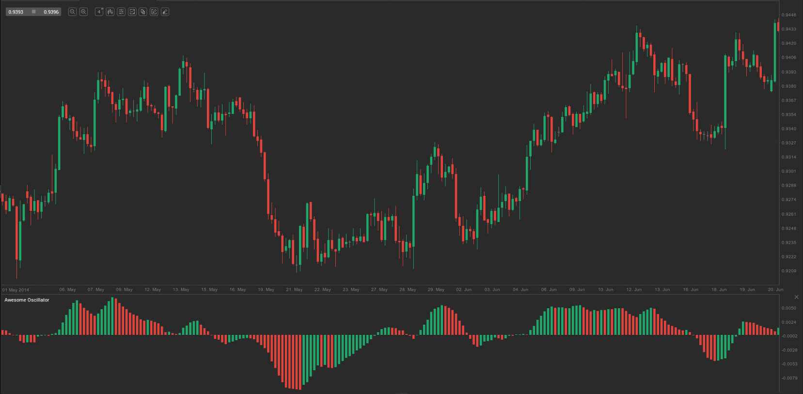
Second, the so called ”Twin Peaks” formation. This is a situation, when the Awesome Oscillator forms two peaks on the same side of the centerline. When the two peaks form below the centerline, this provides a trader with the opportunity to go long. The second peak is usually higher than the first one and is followed by a green bar. The bottom between the peaks needs to remain below the centerline as long as the setup holds. On the 4-hour chart of AUD/USD below we can see what this ”bullish twin peaks” setup looks like.
When the two peaks form above the centerline, this provides a trader with the opportunity to go short. The second peak is usually lower than the first one and is followed by a red bar. The bottom between the peaks needs to remain above the centerline as long as the setup holds.
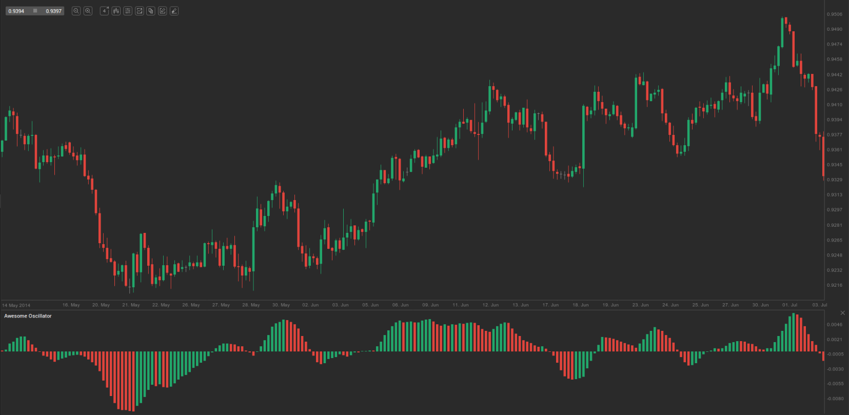
Third, the so called ”Saucer” formation. This method attempts to identify faster changes in momentum. It searches for changes in three successive bars, which are all on the same side of the centerline. A bullish setup occurs, when the Awesome Oscillator is above the centerline and two successive red bars form, followed by a green bar. The second red bar needs to be lower than the first one. On the 4-hour chart of EUR/USD below we can see an example of this ”bullish Saucer” setup.
A bearish setup occurs, when the Awesome Oscillator is below the centerline and two successive green bars form, followed by a red bar. The second green bar needs to be higher than the first one.